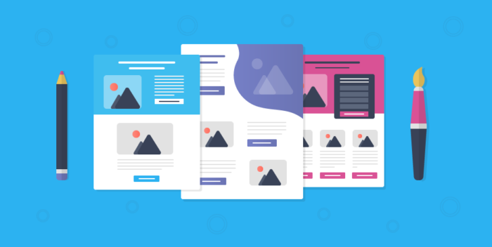
If you’ve been unsure of how to create a landing page, you are not alone. There are several different ways to do it, and we’ll cover some of them here. One of the first steps is to select the type of page you’re creating. Landing pages are single-page sites with shareable URLs that focus on one specific objective or goal. To create a landing page, go to your Sites tab and choose “Create a new site.” You can name it “landing page,” assign it to a subscriber group, and choose a template or content block to use.
Simple copy
When creating a landing page, you should focus on ensuring that the copy is clear and concise. Use short paragraphs that don’t exceed three lines. Spacing paragraphs evenly helps your audience read the page more easily. You should also use bullet points to separate information. While writing for a landing page, it is important to remember that it’s easier to make the copy simple when creating a B2C campaign.
In a landing page, the copy should be simple, concise, and easy to understand. You can explain the product details later in an email sequence, but in the short term, simple copy makes it easier for people to understand the product. This allows them to make an informed decision about whether to purchase the product.
Also Read: SEO Techniques for Better Rankings Your Business Should Use
Multiple CTAs
One way to increase conversions on your landing pages is by using multiple call to action buttons. These buttons should all be pointing to the same destination or form. An example of this can be seen in this example landing page. It removes the main navigation bar and provides only one option for the user to choose.
For example, a CTA for a service provider could ask visitors to download a free eBook or watch a product overview video. It could also use color to evoke emotions. It might also be best to present the CTA as a dialog, rather than using sales tactics. Not all CTAs should have all of these characteristics, so it is important to choose the right one for the type of product or service you are offering.
Designing a hero image
When designing a hero image for your landing page, make sure it relates to the product you’re marketing. The color of the hero image can be one of your brand’s main colors, or it can be associated with its icons or interface tone. The main objective is to make it as symmetrical as possible, as this will create a visually pleasing and balanced design.
Another option for a hero image is a looping soundless video or a GIF. One website that has multiple videos as hero images is the Nomz website. Visitors to the Nomz site tend to stay on the page longer when they can watch the full scene. Designing a hero image for a landing page is not a one-time process, however; it should be regularly updated to stay fresh.
Including social media icons
Including social media icons on a landing pages gives your viewers an easy way to navigate to their accounts. It’s also easy to add these buttons because people are used to seeing them and know what to do with them. Social media icons can be used on your home page, in emails and in blog posts.
When placing social media icons on your landing page, remember to use the right style for your brand. Keep your color scheme light and monochromatic. Use light icons for the buttons.
Including a benefit-focused headline
If you want to increase conversions on your landing page, you need to use a benefit-focused headline. It is imperative to your conversion rate that people read and respond to a headline that explains the value of the offer. By including a benefit-focused headline, you can stand out from the competition.
For example, the Amazon landing page features a benefit-focused headline. This headline is easily digested, thanks to its combination of testimonials and company logos. The company also provides a list of icons for easy navigation. Moreover, the page also includes a video testimonial that demonstrates the features and benefits of the product. It also addresses the objections of the potential customer.
Another benefit-focused headline is used to separate a product from its competition, especially if the competitor is offering the same product or service. For example, many web designers offer similar quality services at similar prices. When a customer sees this headline, it answers the question that they are looking for. In such a scenario, a benefit-focused headline will help them decide whether or not to purchase the product.


